Appointment-to-sold is the last conversion in the funnel and the easiest to misread. The ratio falls when you start booking customers nobody was reaching before — which looks like deterioration and is frequently the opposite, because the denominator grew for a good reason.
This guide covers how to compute the ratio, why it falls when volume rises, the four segments that explain it, what a genuine problem looks like, and what to measure.
How do you compute it?
Units sold from appointments ÷ appointments attended.
Two definitional points decide whether the number means anything:
Attended, not set. Using appointments set blends this ratio with show rate, and the two move for entirely different reasons. Keep them separate — show rate is the guardrail discussed in show rate being the only number, and this is the stage after it.
Attribution window. A customer who came in Tuesday and bought the following Saturday was sold from that appointment. Pick a window — 14 or 30 days is common — write it down, and keep it fixed. Changing it later makes every historical comparison meaningless.
Why does the ratio fall when volume rises?
Because the appointments you add are not drawn from the same population as the ones you had.
Dilution, not deterioration
Illustrative. Substitute your own numbers.
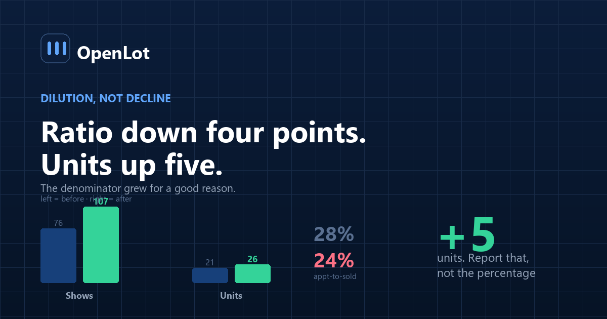
Before After Appointments shown — previously reached 76 76 Close rate on those 28% 28% Units from them 21 21 New appointments — previously unreached 0 31 Close rate on those — 17% Units from them 0 5 Total shows 76 107 Total units 21 26 Appointment-to-sold 28% 24% The ratio fell four points. Units rose by five. Nothing about the store got worse: a lower-converting but entirely real segment was added, and it converted at 17% instead of zero.
The mistake is treating the ratio as a quality score. It is a mix number, and mix changed on purpose.
The correct response to this chart is not to stop booking the new segment. It is to stop reporting a blended ratio.
The four segments that explain the number
Cut it four ways and the blended figure stops being interesting.
1. By source. A third-party marketplace appointment and a repeat-customer appointment are different products. Blending them describes neither — the problem underlying lead attribution.
2. By who set it. Human, conversational assistant, self-serve. Expect them to differ, and expect self-serve to be lowest.
3. By day-part the appointment was set. Overnight-set appointments generally convert lower, and the honest comparison is against the zero they replaced.
4. By whether the salesperson was briefed. This is the one that identifies a genuine, fixable problem rather than a mix effect — and it is usually the largest single gap, per the handoff.
What does a real problem look like?
A falling ratio is a problem when it falls within a segment, not across the blend.
| Pattern | Reading |
|---|---|
| Blended ratio falls, segment ratios flat, units up | Dilution. Working as intended |
| A specific source falls | That source degraded, or the leads changed |
| Briefed appointments fall | A sales-floor problem, not a funnel one |
| All segments fall together | Something structural: inventory, pricing, staffing |
| Ratio flat, units flat, appointments up | The real failure. You added volume that converted at zero |
The last row is the one to watch for. Appointments that convert at zero are not dilution, they are waste — floor time spent on customers who were never going to buy, usually because the booking was set by over-promising or by skipping a qualification step that actually mattered.
Where does the measurement go wrong?
1. Using appointments set rather than attended. Blends two independent effects into one number.
2. A moving attribution window. Lengthen it and the ratio improves for free.
3. Blended reporting only. The whole subject of this article.
4. Comparing against an industry figure. Mix, market and definitions all differ. Your own segments against each other are worth more.
5. Reacting to the blend. The common and expensive mistake: a store sees the ratio fall, concludes the new appointment source is bad, and switches off something that was adding units.
6. Ignoring the floor. If the ratio falls inside the briefed segment, the problem is not appointment quality — it is what happens after arrival, and no amount of funnel work fixes it. Persistent weakness there is frequently a turnover problem rather than a process one.
What should you measure?
| Metric | How to compute | What it decides |
|---|---|---|
| Appointment-to-sold, blended | Units ÷ shows | The trend only, never the diagnosis |
| By source | Split | Which sources are worth their cost |
| By setter | Human / assistant / self-serve | Whether automation is adding or diluting |
| By set day-part | Split | Whether overnight bookings convert acceptably |
| By briefing status | Briefed vs not | The fixable gap |
| Units from appointments, absolute | Count | The number that actually matters |
The last row is the honest headline. A store whose ratio fell from 28% to 24% while units rose from 21 to 26 had a good month, and any report that leads with the percentage will describe it as a bad one.
Frequently asked questions
How do you calculate appointment-to-sold ratio?
Units sold attributed to an appointment divided by appointments attended, not appointments set. Using appointments set blends the measure with show rate, which moves for completely different reasons, and the attribution window — typically 14 or 30 days — needs to be written down and kept fixed.
Why does the ratio fall when we book more appointments?
Because the additional appointments come from a different population: customers nobody was reaching before, who convert at a lower but non-zero rate. The blended ratio falls while total units rise, which is dilution rather than deterioration and should not be read as a quality problem.
Is a falling appointment-to-sold ratio always bad?
No, and treating it that way is the most expensive mistake in this area. The question is whether the ratio fell within segments or only across the blend. If each segment held steady and units increased, the mix changed on purpose and the result is good.
What does a genuine problem look like?
A ratio that falls inside a specific segment — particularly within appointments where the salesperson was briefed, which points to the sales floor rather than the funnel. The other real failure is appointments rising while units stay flat, which means volume was added that converts at zero.
Which segments should the ratio be split by?
Four: lead source, who set the appointment, the day-part it was set in, and whether the salesperson was briefed before the greeting. The last of these usually shows the largest gap and is the most fixable, since it requires no additional leads or software.
Should we compare our ratio to an industry benchmark?
It is rarely useful, because published figures blend store types, markets, lead mixes and definitions that will not match yours. Comparing your own segments against each other, and your own trend over time, produces decisions a benchmark cannot.
What happens if we react to the blended number?
The common outcome is switching off an appointment source that was adding units, because its lower conversion rate dragged the blend down. That decision looks disciplined on a dashboard and removes profit, which is why segment-level reporting matters before any source is cut.
What single number should be reported to ownership?
Units from appointments, in absolute terms, alongside shows. The percentage is useful for diagnosis within segments and misleading as a headline, because a store can improve units and worsen the ratio in the same month.
Conclusion
- Attended, not set. Using appointments set blends this with show rate.
- A falling blended ratio is usually dilution, and dilution that adds units is success.
- Four segments: source, setter, set day-part, briefing status.
- The real failure is appointments up, units flat. That is waste, not mix.
- Report units, not the percentage. The percentage describes a good month as a bad one.
Last updated: